ParkBoston
The development of the ParkBoston app allows drivers to pay for their meters on their mobile phones. But the previous iteration of the ParkBoston felt visually dull and the experience of paying for parking still felt inefficient and slow. The goal was to redesign a parking app that is as efficient as well as minimal and visually coherent.
Client / Year
Role
Duration
Skills
UX/UI
Mobile
Problem
The current ParkBoston app suffers from several usability issues. User feedback indicated that the flow of the app took too many "clicks" as well as not providing enough security when parking there. These issues guided my opportunity to update the app with new design patterns to offer more clarity and efficiency.
Design Process
Initial research was conducted on similar parking apps as well as looking at user feedback from app store reviews to gain empathy for users and gather insights.
Online User Feedback
I collected reviews from Apple's App Store for the original ParkBoston app. I found reviews that had insightful feedback about the app's usability and clarity which would be helpful in recreating a more efficient parking app.

User Flow
Users mentioned a problem of "too many clicks" which prompted me to analyze the task flow of the primary task of paying for parking.

Key Feature
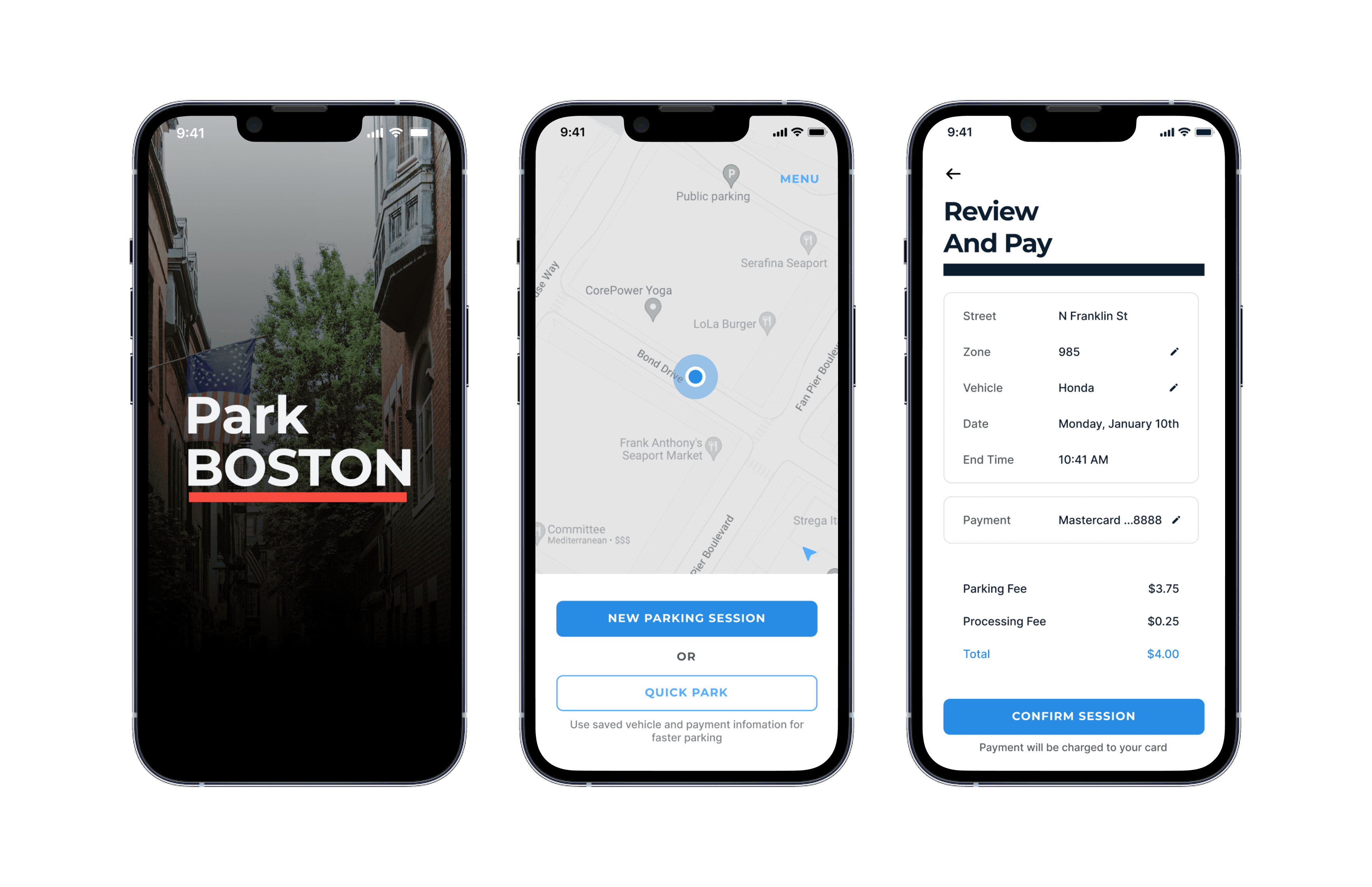
To improve the efficiency of the primary experience, I consolidated the functionality into one less screen as well as devised a feature to reduce the number of clicks, called "Quick Park". Similar to how Amazon has their "1-Click Buy".
Final Design
For the final testing, I chose 5 users who are drivers and have experience parking in the city. Overall, users appreciated the ease of use and clean design. They also appreciated the map, which made them feel more secure of their designated parking zone (could be something to explore further)
In addition, they enjoyed the "quick park" feature as the majority of the testers primarily drive one car and pay with the same payment method.
Onboarding
Quick Park Flow
Menus
Reflection
I did not use a paper prototype before the low fidelity wireframes which would've provided an extra trial of testing. This resulted in unvalidated assumptions with the email vs mobile account creation. Lastly, I would like to explore other methods of data analysis such as user stories, mapping out user journeys and performing a heuristic review.