Lava.space
In this fast-paced project, I had the opportunity to work with a client who wanted to create a note-taking app with innovative features such as AI-generated image cards and tags for each note, mind mapping, and social functions. The goal was to create a minimum viable product (MVP) that would showcase these unique selling points and provide a user-friendly experience for note-taking and sharing. Given the client's plan to test with users the following week, I had only a week to complete the project, making it a challenging and time-sensitive endeavor.
Client / Year
Role
Duration
Skills
UX/UI

Design Process
Given the tight timeline of the project, daily meetings and conversations were held with the stakeholder to ensure that we stayed on track with the scope and design iterations. With no access to users, I took a unique approach by analyzing Obsidian, a competitor app, and watching YouTube videos to understand how users interacted with similar note-taking apps. This enabled me to quickly grasp the features and capabilities of such apps, as well as the users' journeys and use cases.
The process began with an initial wireframe provided by the client, and with my research findings, I refined the wireframe and conceptualized a visual language which aligned with the client's vision and preferences. I used the site map provided by the client to design the rest of the screens for each feature, paying attention to accessibility concerns such as the use of text over images and appropriate color contrast. Throughout the process, I kept the stakeholder engaged and involved in the design decisions, ultimately resulting in a high-fidelity design that fulfilled the client's vision.
Competitive Analysis
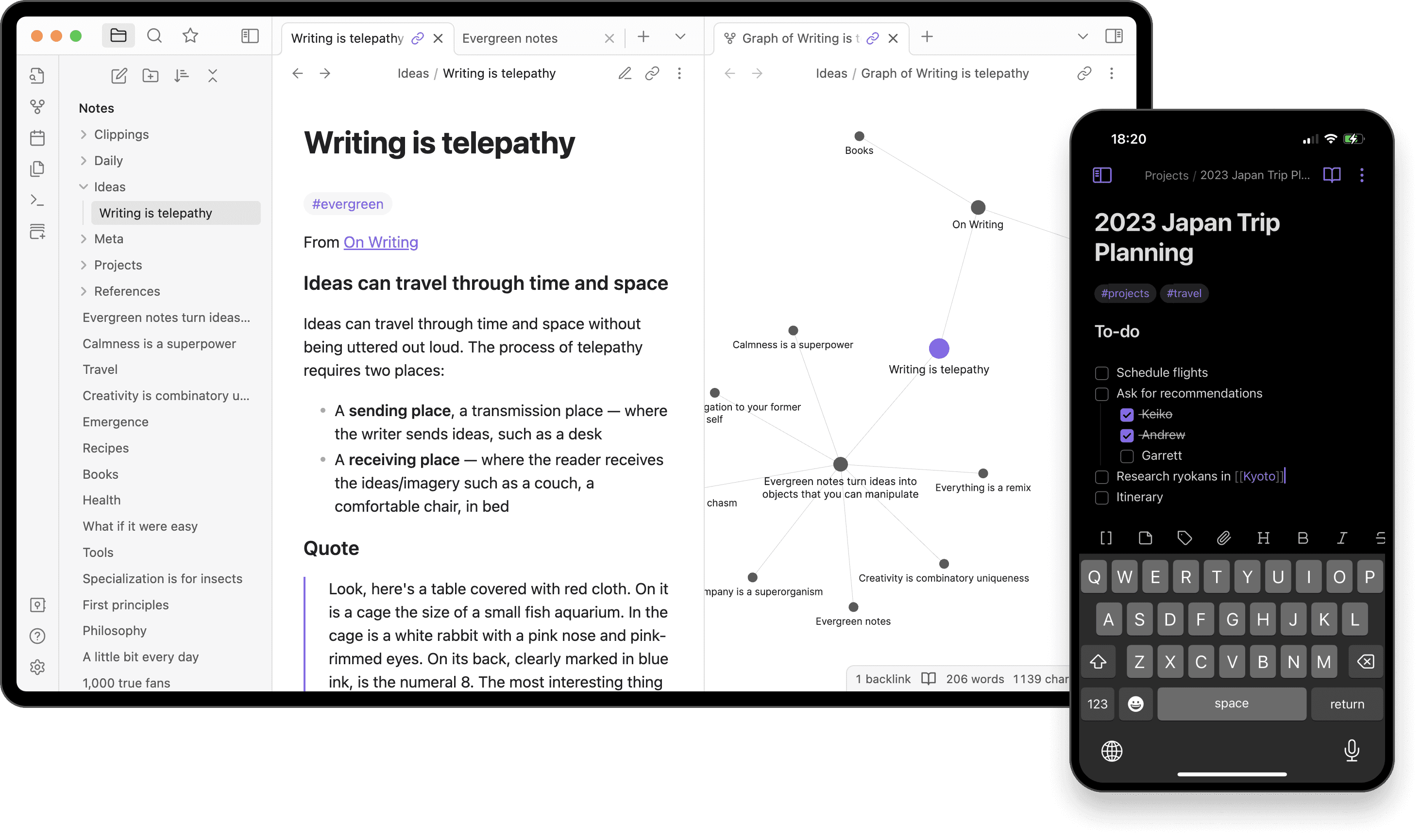
Obsidian was our main comparison point. However, I looked at other apps such as Apple Notes, GoodNotes, Notion, and Napkin. We appreciated the simple design of Obsidian but found some of the features hard to understand at first glance.
(Pictured Below, Obsidian UI)
Modules
The modules of are independent and can be freely resized and moved around the browser, emphasized by the elevated style.
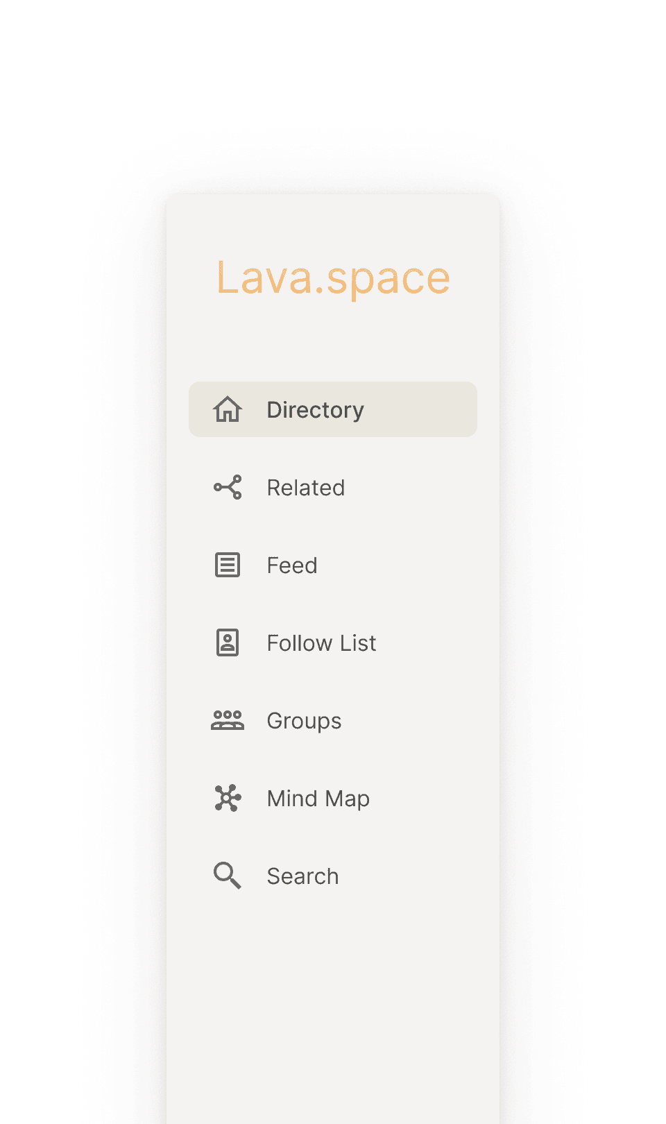
Navigation Bar. I opted to use both icons and text to help users easily navigate the app.

Directory. I combined a tab filter and breadcrumbs so users can seamlessly move through their notes.

Cards. Bring your notes to life with personalized AI-generated images.
Editor. Designed to provide a clean and simple interface for editing your notes
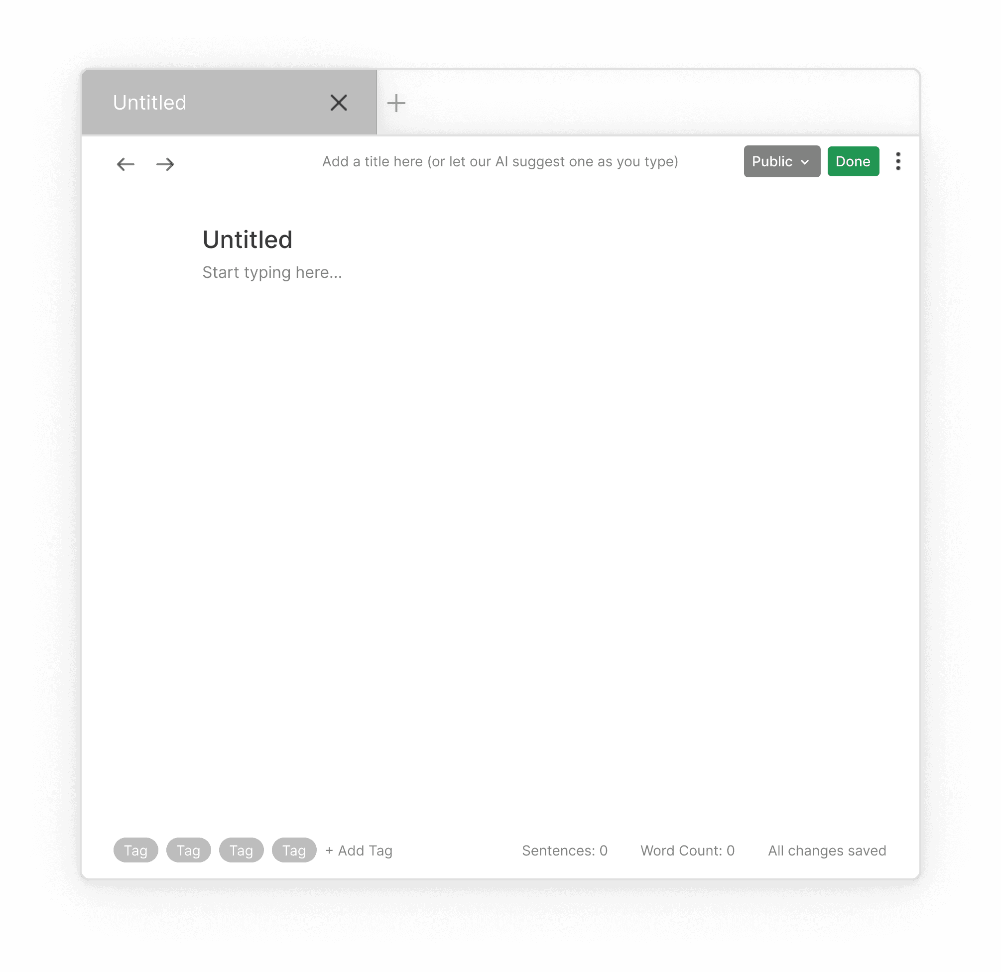
AI Image Card Generation Flow
Reflection
This project taught me a lot about communication. It drove home the idea that a designer is more than just someone who designs - they're also a communicator. Design involves taking a mess of ideas and distilling it into a clear, cohesive vision. And whether you're using words or design, the key is to simplify those complex concepts into something easy to understand.
The project was definitely a face-paced one, but I made sure to keep my stakeholder engaged and involved throughout my design process with daily check-ins. Whether it be about scope, design feedback or presenting my deliverables.
While this project was only a template for their design which is to be released later, I would have loved to hear the results of my client's user testing and see the user feedback would be like.
If I had more time, I would like to reach out to any users to get feedback on what they think about the usability as well as the selling point of the app.