Verdant Yard
Upon venturing out to a local brewery post-lockdown, I encountered a frustrating experience with poor layout, slow wifi, and the summer heat. This inspired me to create a fictional brewery with a unique UX design and aesthetics, distinct from existing applications. I aimed to design a platform that embodies warmth and thoughtfulness.
Client / Year
Role
Duration
Skills
UX/UI
Brand Identity
Visual Design
Problem
The COVID-19 pandemic undoubtedly changed the food industry's relationship with physical menus and in-person ordering. For taprooms and beer gardens, this means choosing your selection from a virtual menu and proceeding with payment, all on your personal mobile device.
The issue is twofold — the process is unoptimized for easy ordering and lacks the personality and charm from interpersonal interaction. Extended loading times, downloading apps, and poor overall design lead to fatigue.

Design Process
To improve the customer experience, I identified pain points and work towards a solution that streamlines the ordering process. I created a persona, Sonia, to help shape the design direction. I conducted heuristic-focused competitive analysis of local breweries to uncover the problems early.
Meet our persona, Sonia
She is a 24 year old grad student from San Francisco, CA. Currently residing in Cambridge, MA.
She has
A phone
An interest in craft beers and natural wines
An deep appreciation for beautiful things and works of art
She doesn't have
Patience

Heuristic Evaluation
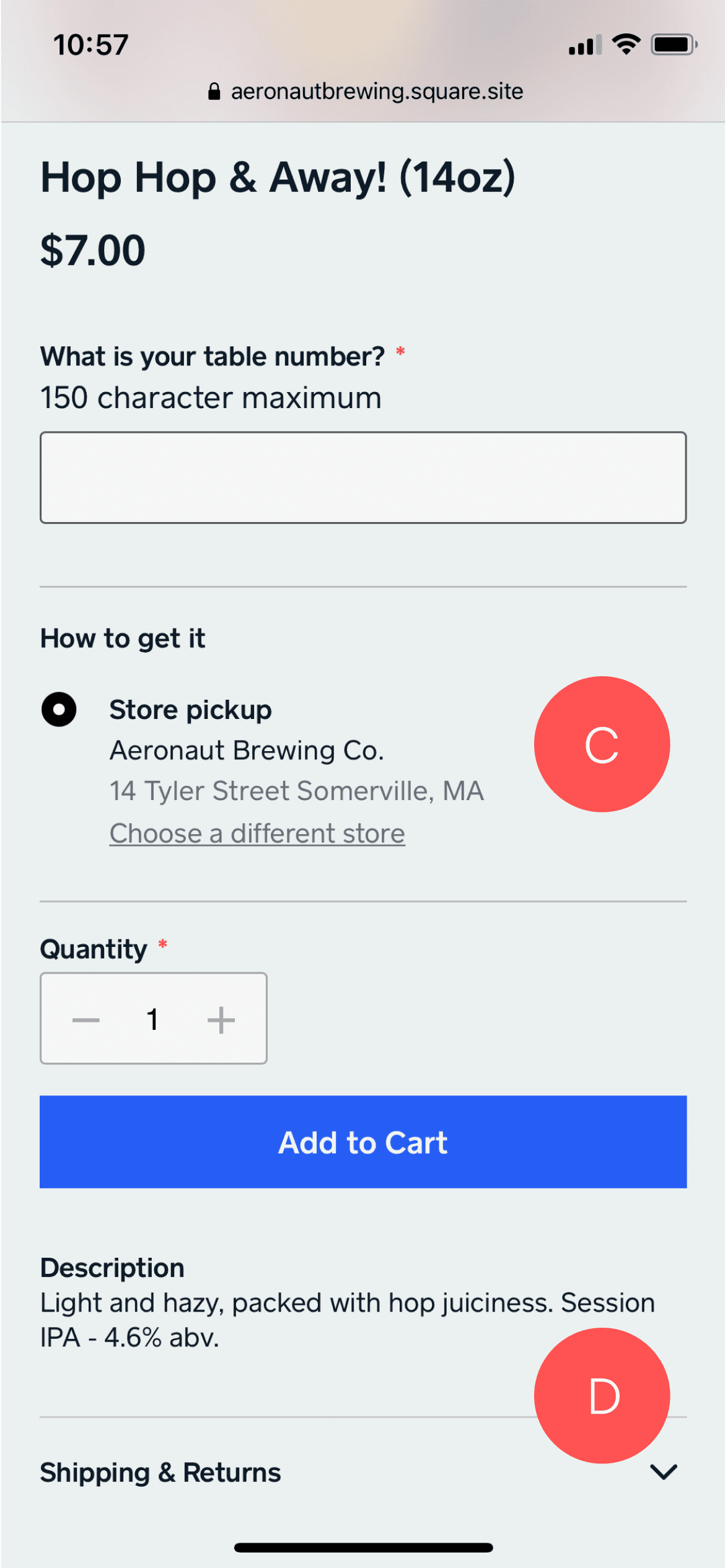
I found one brewery, called Aeronaut Brewing that used the Square platform for their ordering system. While I was going through the primary flow, I discovered many issues that I would like to improve.


A. The images are large and take up a majority of the screen, making it so that you can only see one drink at a time. Also, there are no descriptions or labels regarding the type of beer it is. There is no way to filter through the menu.
B. When selecting a drink, you're taken to its detail page with a large photo but no meaningful information. The table number input field, which takes up too much screen space, could be moved to the beginning or end of the ordering process.
C. This brewery has contactless interaction where the staff bring the drink you order to your table. This "How to get it" section address for a store pickup serves no purpose to customers drinking at the brewery. Again, taking up more screen space.
D. The description is at the bottom of the page, below the fold, making it hard to access. This process needs to be repeated if needed to read the description of multiple drinks. This repeated process leads to scrolling and browsing fatigue and working-memory load.
Wireframes
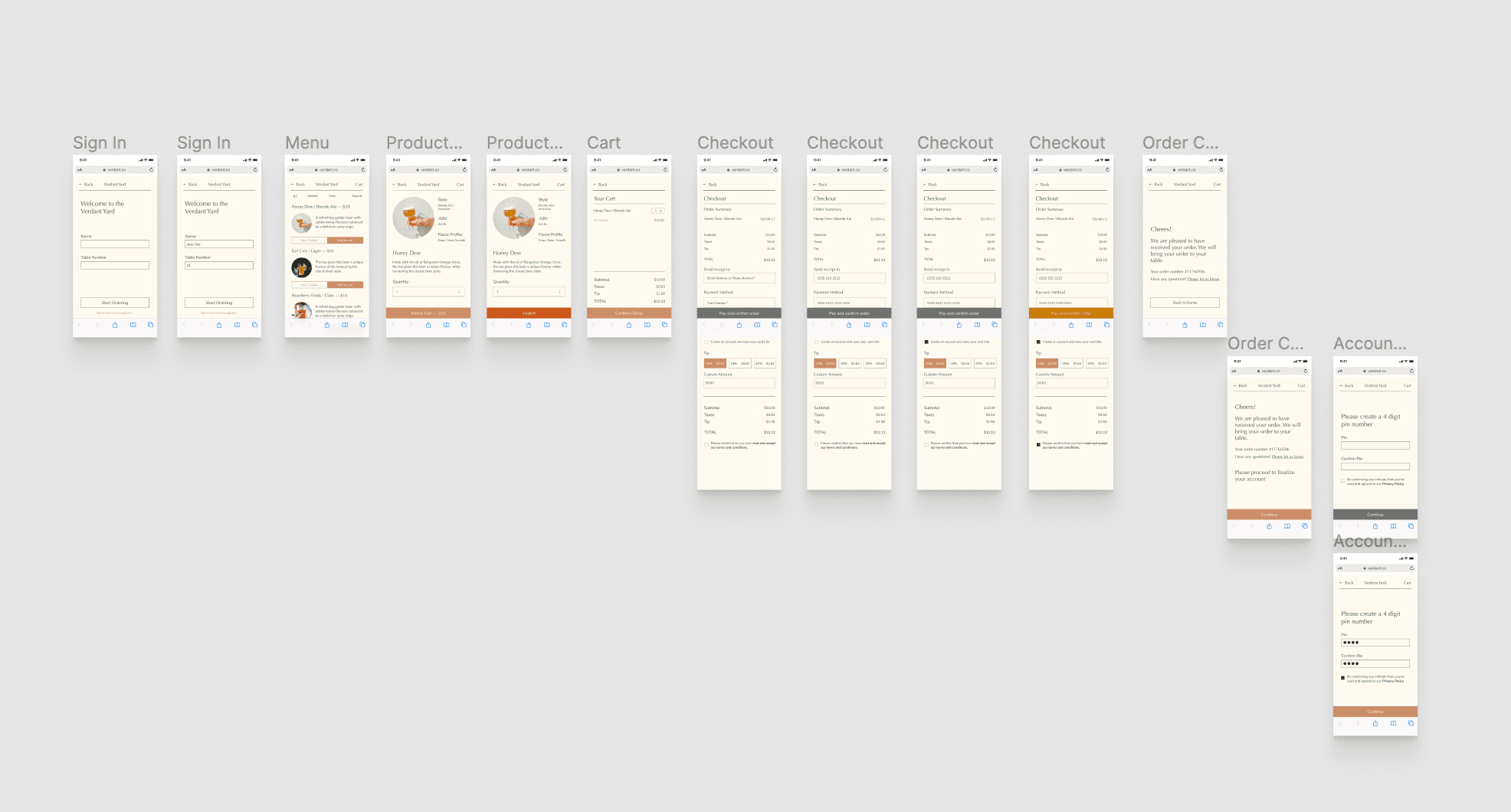
Using Figma, I converted the paper wireframes into digital lo-fi wireframes. I made sure to use conventional blocks to represent text fields, text and image placeholders. I also used the conventional greyscale color scheme and a few instances of simple copy.

High Fidelity Mock Ups
Inspired by our persona, Sonia, I selected a color palette of cream, green, and orange to evoke a sense of nature, warmth and an inviting feeling. The typography combines a chic serif font with a modern san-serif style to reinforce the stylish and sophisticated aesthetic.
Revisions
Here, I removed experimental features. I also addressed issues of the filters "doesn't seem clickable" and adding icons to the payment page to give users a better sense of trust and security.

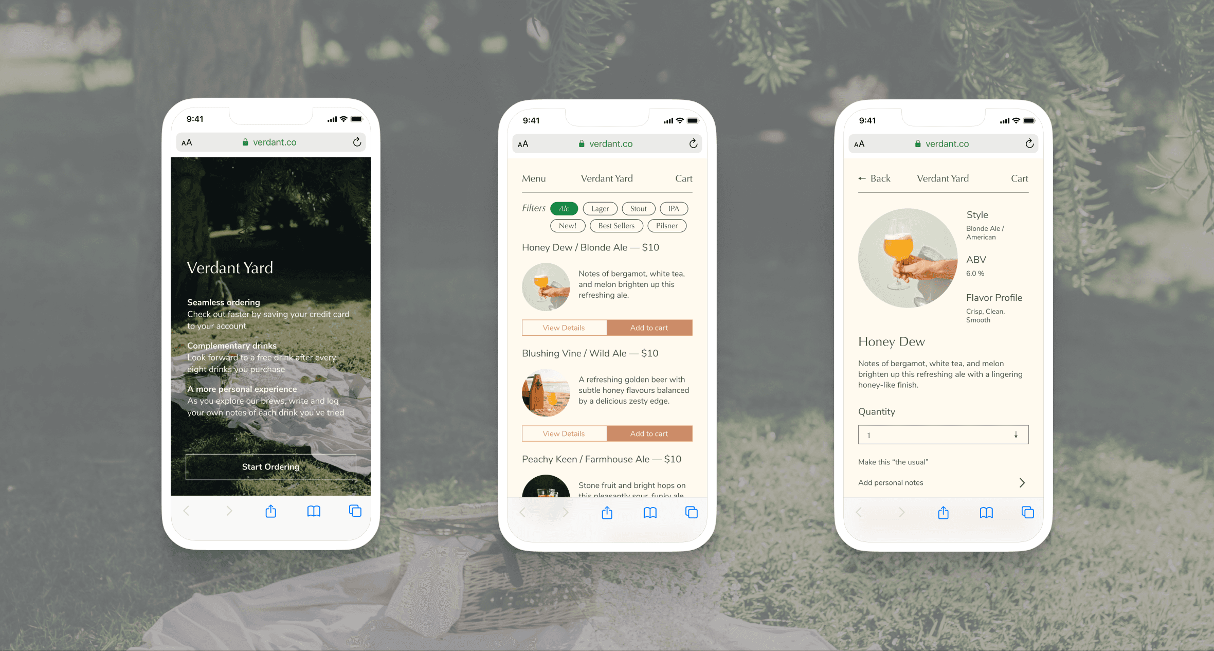
Final Design
The final proposed design for the menu includes cropped images of the drinks, which allows users to see the color and get a sense of what the drink might taste like. These images are smaller in file size, which results in quicker load times and better translation to a small screen. The design also includes descriptions of the drinks, simple filters so users can quickly sort by beer type and the use of typography and color to create a sense of branding.
The checkout include the implementation Apple and Google Pay and in an age of digital transactions provides users a quick, trustworthy payment method. The checkout process for manual payment is kept simple.
Reflection
Getting more comfortable in Figma. I can feel my designs becoming more consistent. Before when I was designing, whenever I made changes, I’d have to go back to make the change screen by screen but now with components and a design system, things are much easier and efficient.
Online usability tools. I wasn't able to conduct usability testing with users in-person so I found Maze, a usability testing tool. It was incredibly useful and allowed for a seamless experience for myself and the testers.
First time creating something rather than just redesigning something. It was fun and challenging. I'd love to learn more about branding and visual design. I’ve pondered about the idea of designing for an experience rather designing on the spectrum of good UX and bad UX. While keeping usability in mind, I felt I was able to design for a warm, thoughtful experience while also expressing an aesthetic ethos of the brand identity. I'd love to explore this further in my UX/UI design journey.